This week in my web business creation class I have been studying site design. Because I have a decent amount of experience in web design and the principles that go into user experience, I have tried to use this week as a back to basics reminder. In my experience with web design as you start to get more experienced you start to add more to your pages and focus on the little details. For me this resulted in cluttered sites and confusing flow at times because I lost sight of the end user.
In our readings one of the suggestions was to start with wire frames and a sitemap which is the main thing I worked on this week. If a website can look good as a wireframe and make sense, then it is much easier to get it to look good once you add the content if you have the end goal in mind. For my website I decided to go for a more simple, minimalist style to avoid cluttering and keep the focus on the products and services that I offer, but I still want to communicate warmth and romance which can be hard to do with a minimalist design because they often feel cold and empty.

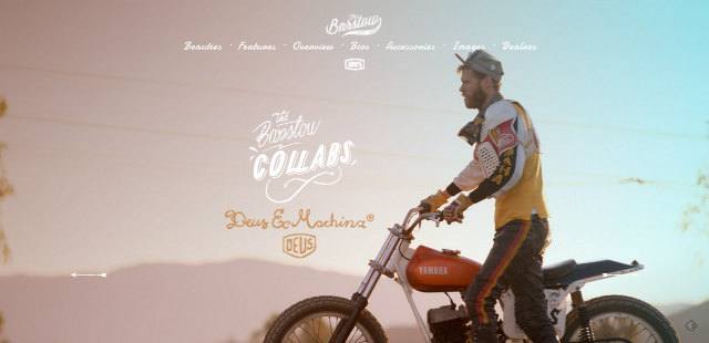
This was one site that I found which I think balances the warm style I want as well as the minimalist feel that is straight forward and easy to navigate. While I don't have product images yet, I think I could find some sweet stock photos of people on dates that would work well for an overlay header and then overlay my brand colors in a gradient like this.
The other thing we discussed this week was how to take payments through the website but I don't really think I will have an issue with this considering my experience with WooCommerce on websites such as Bewholeagainfarm.com